An open source data visualization tool by Nightingale Health
And how it is to work for a vibrant, scale up company.
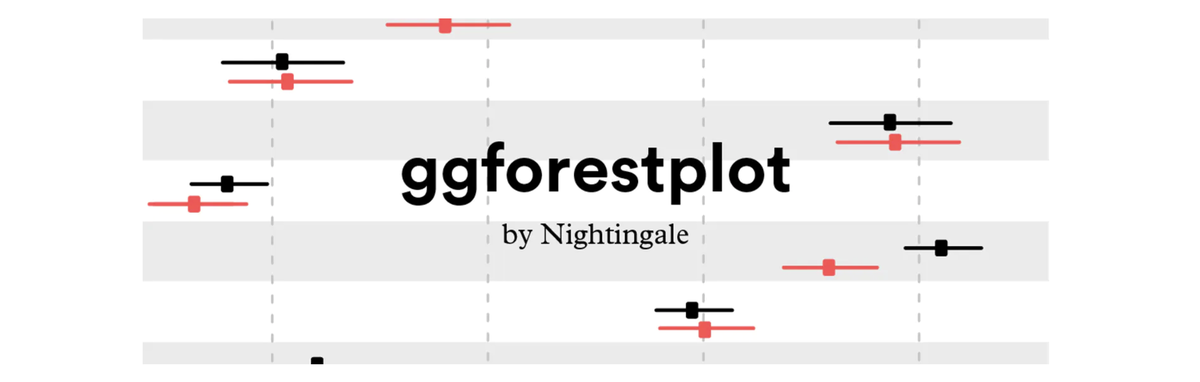 Image credit: NIGHTINGALE HEALTH
I have now been proudly working for Nightingale Health for more than 3 years. It’s been a place that combines intellectual curiosity and coziness (usually found in academia - or well, a startup) with a great teamwork energy. Nightingale is a Finnish biotech, scale-up company that has developed a biomarker analysis platform using NMR technology. Having offered the service to epidemiology research groups for more than 7 years now, the vision is to bring the technology to everyone, in the form of individual testing, providing insight in one’s own metabolic health and that way helping people prevent chronic diseases. (Have a look here for Nightingale’s blood test!)
Scientific research lies at the very core of Nightingale. This bit certainly
played its role for me, when moving from academia to a company, three years ago.
Faithful to its values, last year Nightingale offered some of its data
visualization and analysis machinery to the broad audience. ggforestplot is an
R package to visualize efficiently different types of association results.
You can access the tool, tutorials and functions
here.
Open source and R FTW! I really enjoy using R and I must admit that I actually (re)discovered it in Nightingale. I have the great - let’s call it - luck to work closely with a team of more than ten highly skilled data scientists and engineers, that compliment each other in harmony. It’s there I got the chance to learn how to build reusable tools and enjoy this unique feeling of fulfillment this gives you afterwards.